 New page layout
My husband is a critic (of my photos, writing, cooking or whatever else I do), who could be harsh and direct and sometimes makes me want to just quit…But only for a few minutes. He would stay silent for a long time and later asks me, if I have reflected on what he has said. Well, it’s his reverse psychology technique , and ironically it makes me see what I should.
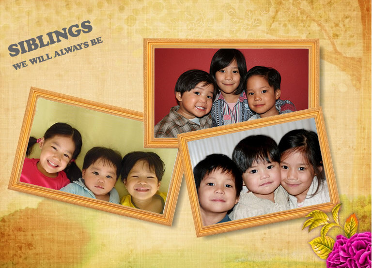
I am a plain person, that’s for certain. That’s why I preferred to have a simple white background layout, no other condiments. He saw the layout of this page and I received a long sermon from him, the graphics expert.
After the bashing, he finally took the time to make a design. Whew!

So, I hope to keep up with this change, find new things and write ’em down. You’ll still see the same format once in a while but surely I’ll add more.

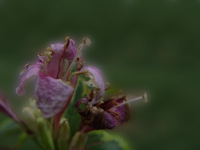

I love this bug photo—every detail is there to be appreciated. Love your header, too…it’s not plain at all! 😀
Thanks Luna, glad you liked it! The former layout was plain, I also like how hubby made this hehe…